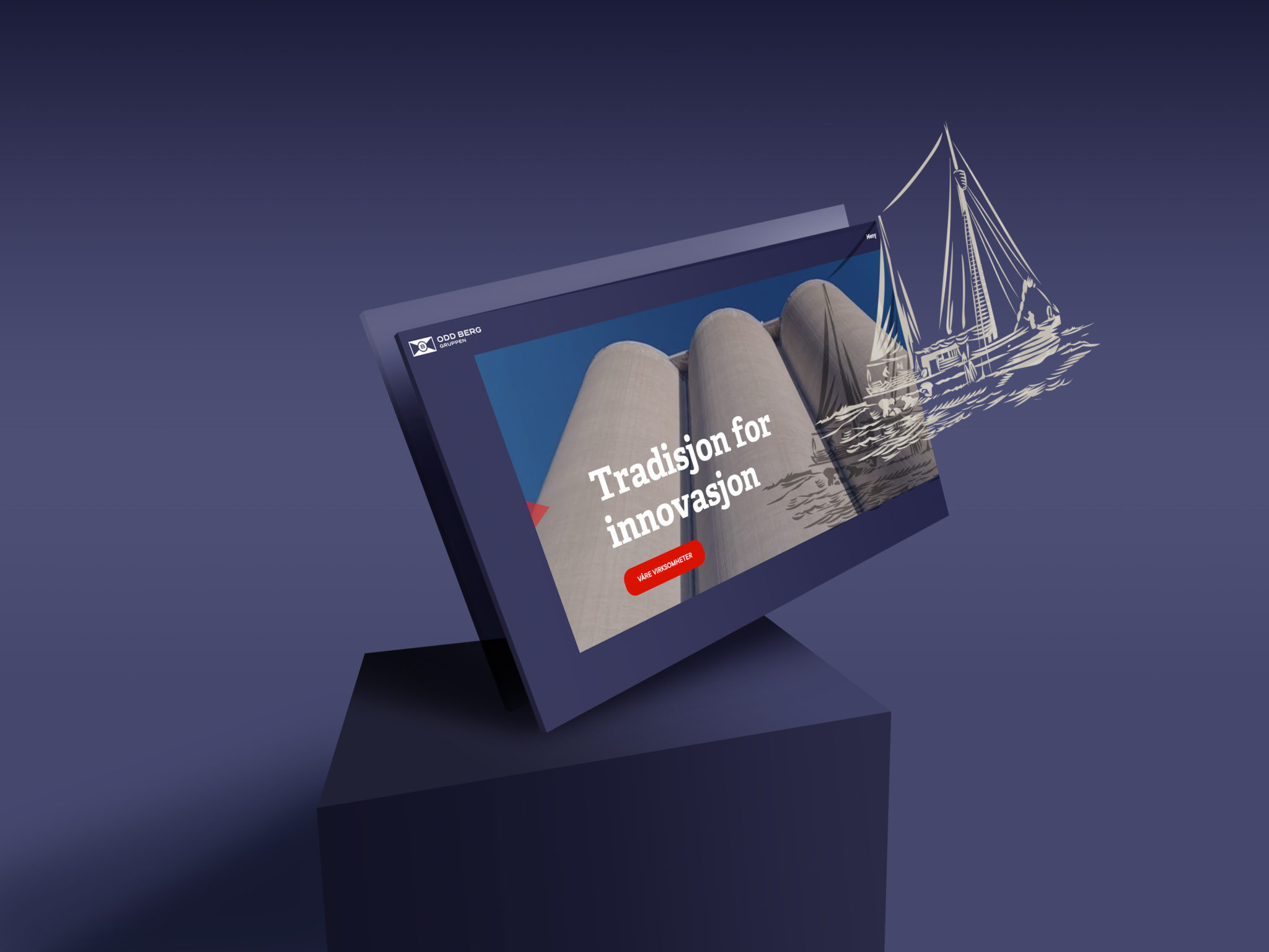
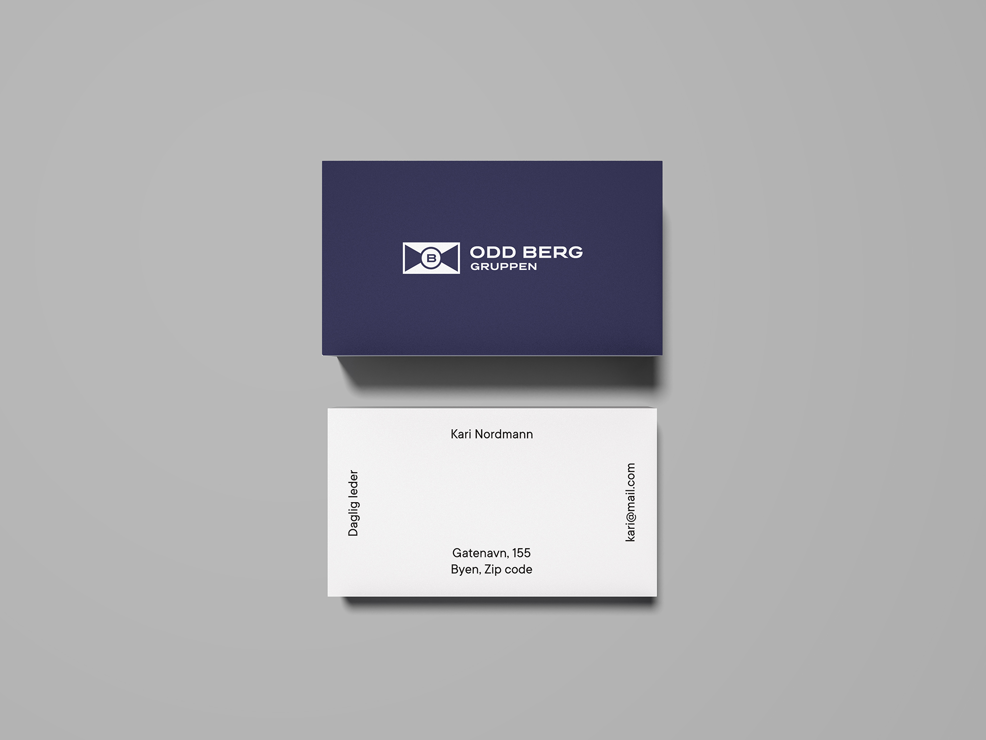
Odd Berg
![](https://rostkommunikasjon.no/wp-content/uploads/2020/08/Logo-transformation-1.png)
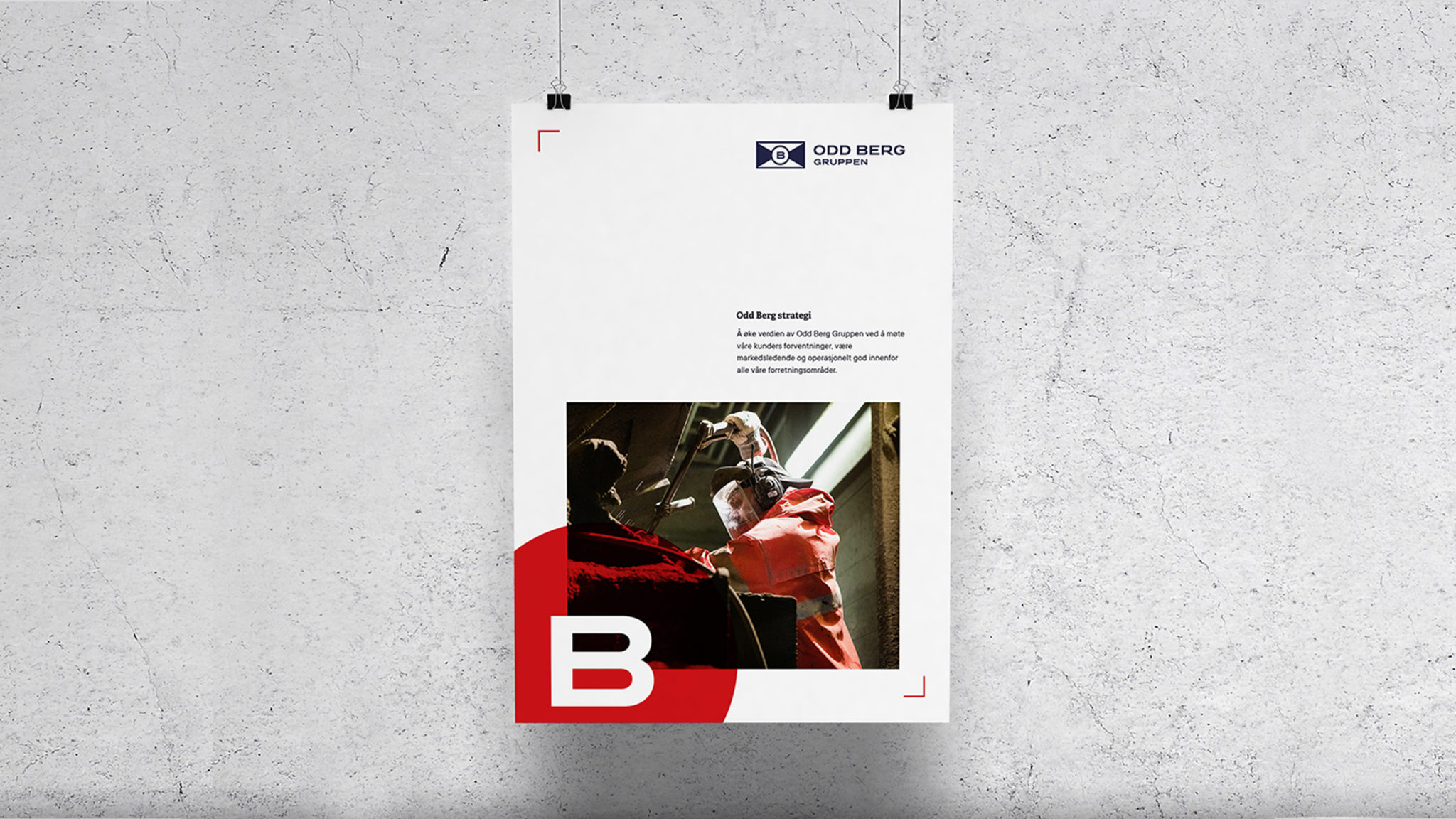
Et ansiktsløft for konsernet på grafisk profil og nettside. Røst tok utgangspunkt i den seneste logovarianten og moderniserte proporsjoner og fargebruk. En omfattende grafisk profil, sterkt knyttet til konsernets strategi ble utviklet.
![](https://rostkommunikasjon.no/wp-content/uploads/2021/04/Metal-Brand-Logo-Mockup-2048x1615.jpg)
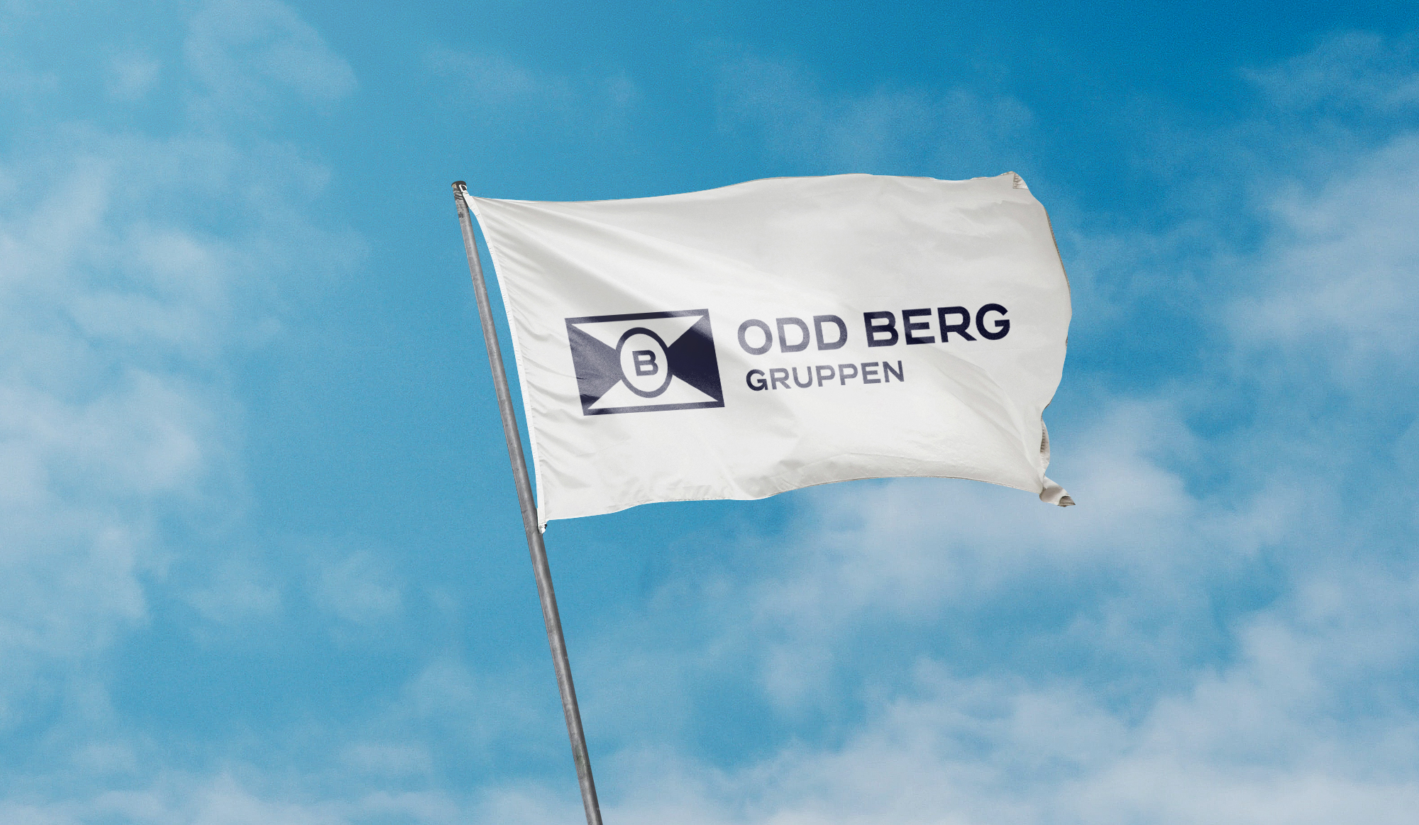
En egen negativ-variant av logoen slik at logoen fremstår likt på mørke og lyse bakgrunner.
![](https://rostkommunikasjon.no/wp-content/uploads/2020/08/Overhead-Business-Card-Mockup.jpg)
![](https://rostkommunikasjon.no/wp-content/uploads/2020/08/iPad-Mockup-Light-1.jpg)
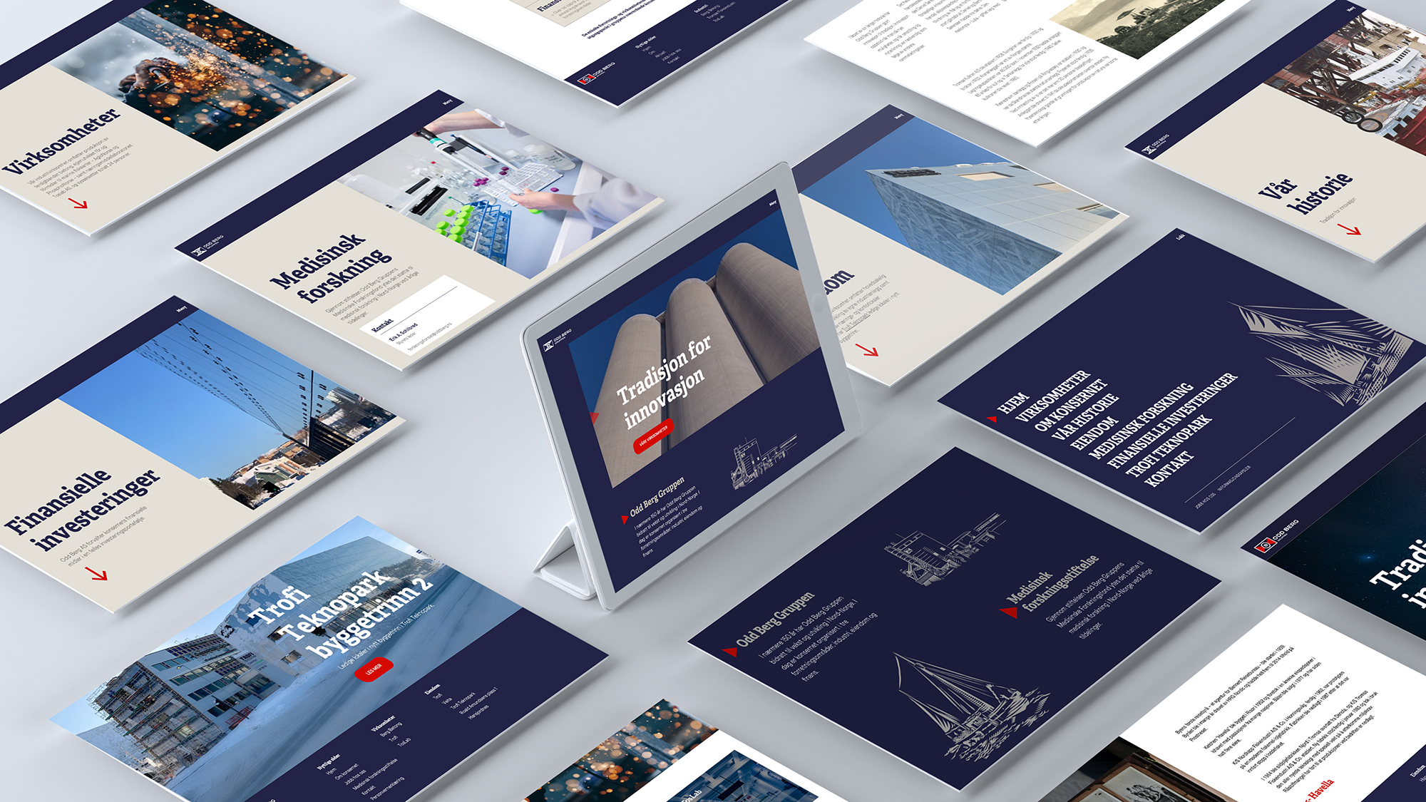
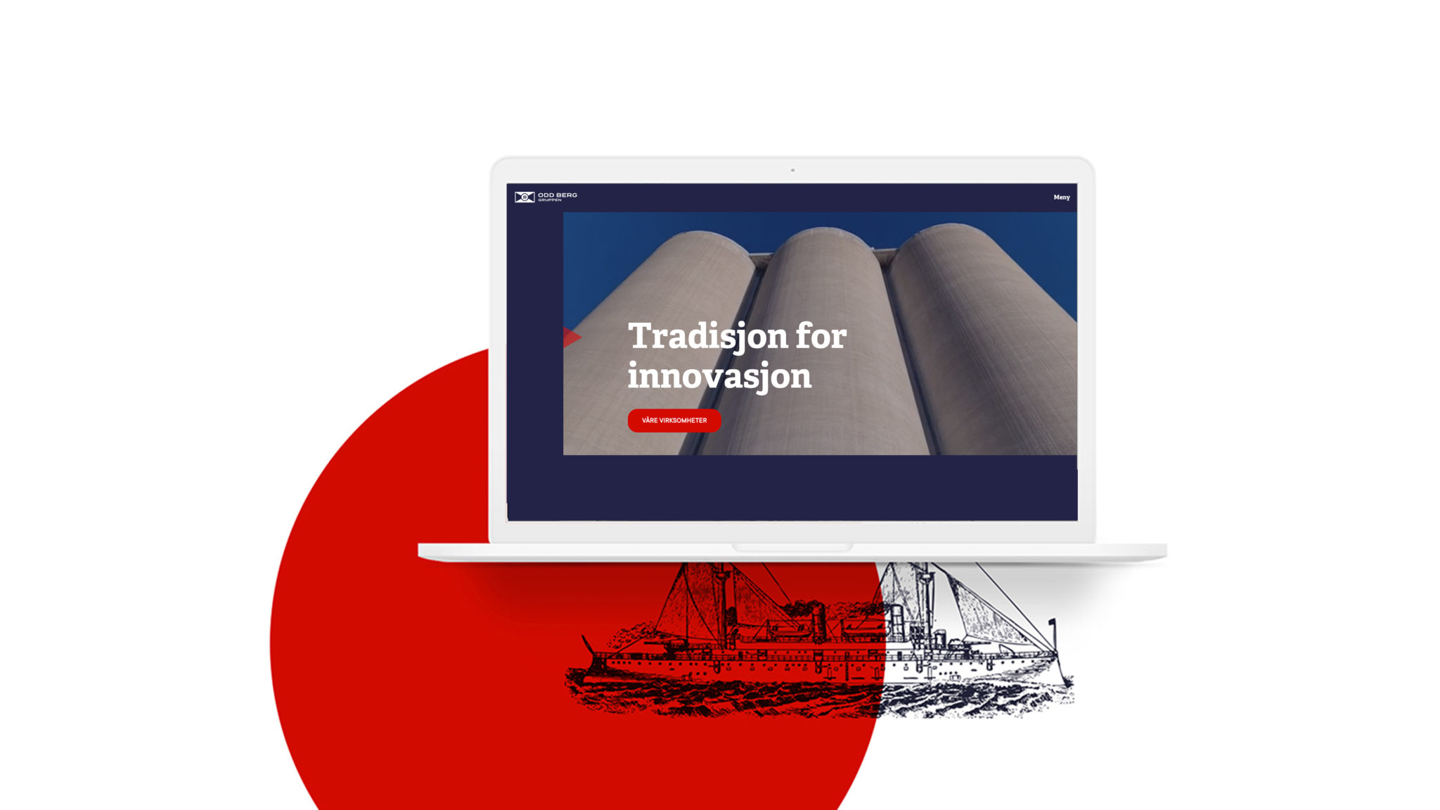
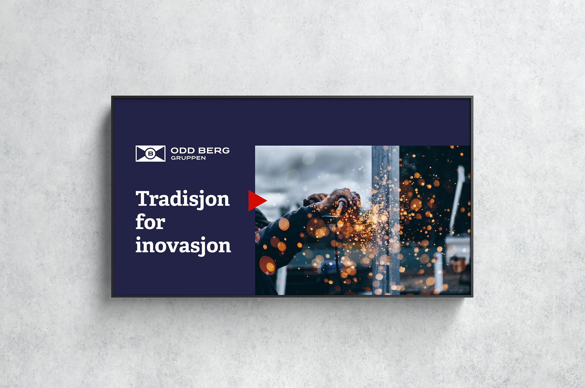
«Tradisjon for innovasjon»
Nettsiden har tatt utgangspunkt i konsernets historikk for bruk av nyvinninger innen sjøfart og industri.
![](https://rostkommunikasjon.no/wp-content/uploads/2020/08/poster-2048x1152.jpg)
![](https://rostkommunikasjon.no/wp-content/uploads/2020/08/screen-application-copy-1-2048x1152.jpg)
![](https://rostkommunikasjon.no/wp-content/uploads/2020/08/Free-Concrete-Wall-Advertising-Billboard-Mockup.jpg)
![](https://rostkommunikasjon.no/wp-content/uploads/2020/08/OB_flagg-copy.jpg)
![](https://rostkommunikasjon.no/wp-content/uploads/2020/08/hero-and-illustration-2048x1536.jpg)